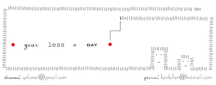
We originally had a hard time deciding on a blog template because I found that all of the pre-made blogger templates felt a little too generic. However, since we don't have the time to design and code our own design, I finally decided that a visually catchy logo image was the way to go, and designed this.
It started with a rough sketch that I drew in a car while waiting for my friend as she paid for a tank of gas. I sat down later at home and put the image together in Visio. I went with Visio because I've been using it for years. Visio's actually a flowcharting software, and definitely not the first-choice software for graphic artists - it's probably the visual design equivalent of playing the saw. But I knew I could make a nice graphic quickly and not have to worry about any learning curve.
The tick marks that make up the border were part of my rough sketch, as were the dots and different fonts. There are 365 tick marks with one in a different colour to indicate the one day that we're not taking off. (No, I didn't count them one by one - I made groups of 10 and then just copied and pasted). Pierre suggested that the whole 365-ticks thing might be clearer if the border was made out of bundles of five (like in the top right-hand corner of the image). I thought that might make it a bit too busy, so I just put in a couple. (Which, incidentally, is slowly driving him crazy. By the time you read this, there will probably be just one bundle instead of two).
The heads showed up by accident when I was trying to find ways to decrease the height of the image without changing the width. They were too cute to pass up.
Subscribe to:
Post Comments (Atom)

1 comment:
love le logo...love the little heads - i am very happy you didn't pass them up :) x
Post a Comment